
learning moore
BRAND IDENTITY // WEBSITE DESIGN // CORPORATE STATIONERY
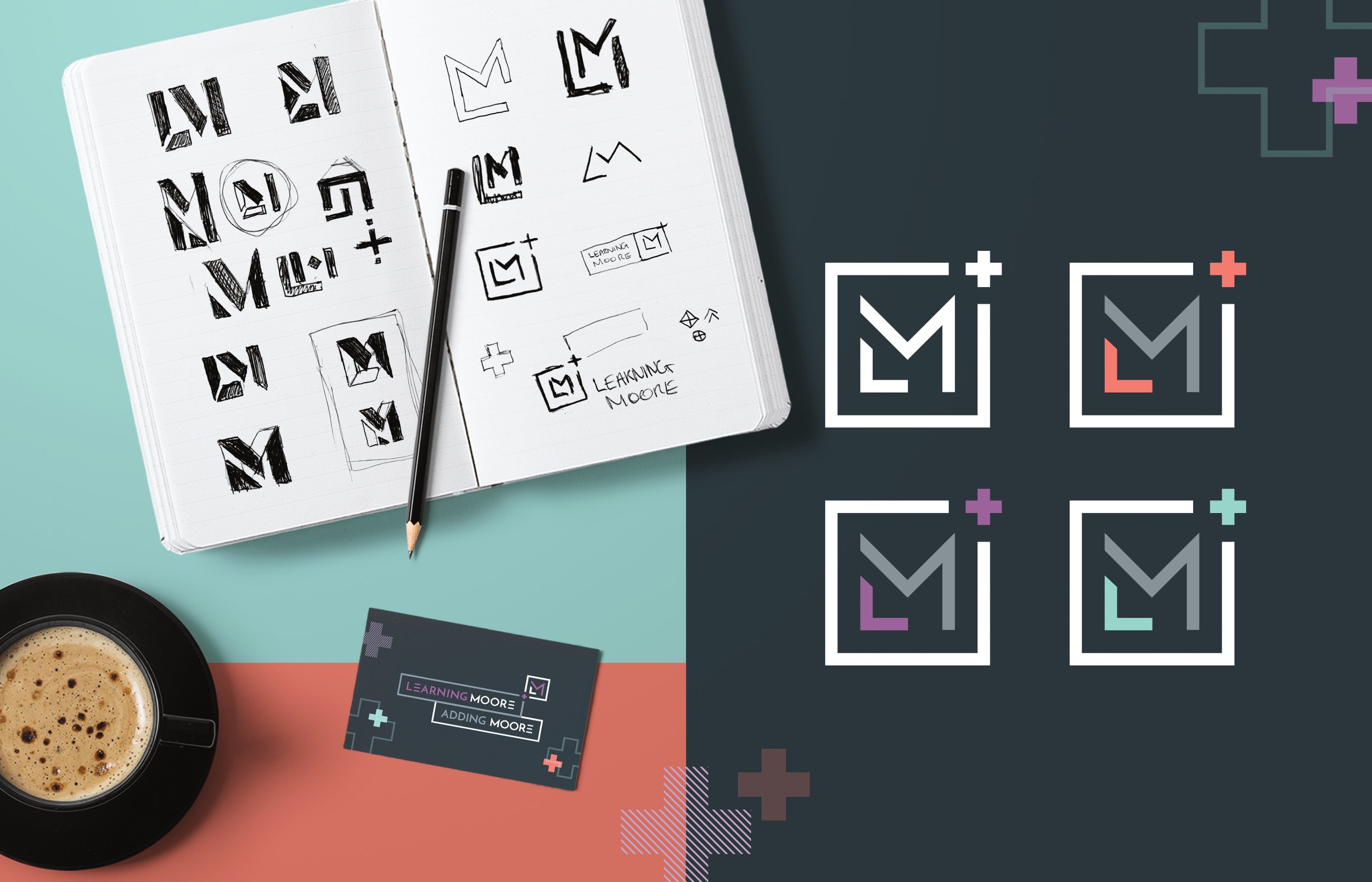
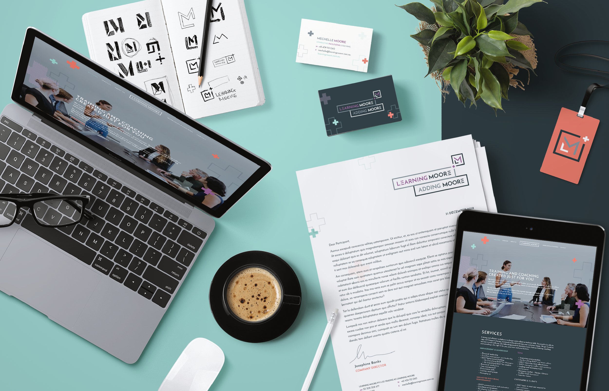
Amie Harrison was commissioned by Learning Moore, a learning and development consultancy started by Mechelle Moore, to design their brand identity. A fresh, clean and playful aesthetic, the brand mark utilises a contemporary geometric arrangement which has been designed to reflect the organisations tailored and modular approach to coaching and training.
The capital letters ‘L’ & ‘M’ from the company name have been incorporated into a bespoke framed monogram. The plus symbol subtly reflects the ‘adding’ of skills via education and has been chosen to compliment the word Moore (more).
The brand mark has been designed with various lock-ups, including a colour palette alternatives and combinations with the tagline "adding moore".
Additionally, the project scope included corporate stationery, presentation and workbook templates and website design.